Transform your photos into custom photo puzzles or shop our selection of puzzles from millions of independent artists!
1 Year Ago
Hi. I hope this is ok to post here. If not, please forgive me. I did reach out to customer service via email and await a response.
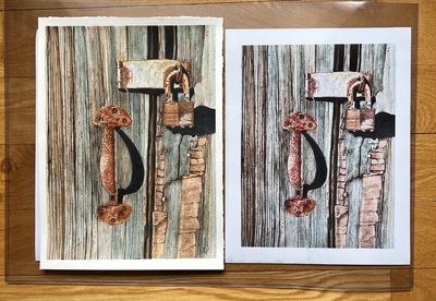
I am a new member of FAA and I ordered prints of my artwork to see the quality of the product. I received them today and they are not representative of my original nor the images I have uploaded. I’ve uploaded files for comparison. My original is on the left and my uploaded file is the same. On the right is the print I purchased.
Is this due to my image pixels or something I’ve done incorrectly? If I were to order prints to sell at a show where my original work is displayed, the difference is so obvious that I couldn’t possibly sell the prints.
Thanks for any thoughts or feedback. To clarify, this isn’t a complaint in any way. I’m so impressed with FAA as an option for selling my art and the community is so wonderful. Really just looking for help.
Maggie Hart
Reply Order
1 Year Ago
The one on the right is much cooler in color. Is that what you were sent?
Do the images you have uploaded here look the same as they do in your files? Are you uploading sRGB or RGB color profile?
1 Year Ago
The one on the left looks like what I see more or less on the screen. Was it printed on silver paper? That may cool it down.
----Mike Savad
1 Year Ago
I had a real probelm with my images not coming out with the color I see on my screen. Long story short, it was my screen, it wasn't calibrated properly. Purchased a calibration tool and now my images come out spot on. I haven't had FAA print any for me since I now print my own, but I have done metal prints elsewhere and they are beautiful. So if you aren't callibrating regularly, you might want to try that.
1 Year Ago
Jessica, the one on the right was the one I purchased. You are right it is cooler than the original. Mike, The one on the left is My original and it looks like my uploaded image file. It wasn’t printed on silver paper. Jessica, I’m not sure about RGB color? I don’t know what that is. ? Rebecca, a calibration tool? This is so over my head. Yikes. I appreciate all these responses and will research all your ideas. Thanks so much.
1 Year Ago
There is sRGB and aRGB. S is the standard profile monitors use, its what I use. ARGB is for Adobe based, and it has a larger green and blue gamut. That makes landscapes look richer, but those with screens set to s it will look bland.
A calibration tool is a small camera that measures the colors of the screen and matches it to a profile. So if you have a screen that tints warmer, brighter, cooler, etc, it will adjust the profile so it looks right. Its expensive but it allows you to know if the color is right. I have an iDisplay using DisplayCal and that works pretty well. Have to run it every few months. Monitors change color as they age. Better calibrators can even do your scanners, printers etc, but those are much more money.
----Mike Savad
1 Year Ago
Since the display image on FAA seems to be close to the original, I'd say that it's a problem with the vendor. Some printing companies use automatic software adjustments and from my experience that seems to be the issue.
It's not an sRGB vs. aRGB issue either. That usually results in saturation and contrast issues, not color shifts.
1 Year Ago
Mike, thanks so much for that.
I have a MAC and it I just read that it has a re-calibration tool built in. I will run it.
What I see on my screen is very close to my original artwork though, so I’m not sure that is the issue. (Art on the left and purchased print on the right).
I purchased a print of each of my uploaded artwork and the others are off a bit but this one is very different.
I wonder if it would be better printed on watercolor paper? I’d like to use FAA as my printing source but only if the print’s match my original artwork.
1 Year Ago
I'm not sure how well an internal calibrator works. It couldn't hurt, but I don't think its the same. Also the glare on a screen, how filthy it is, the light color in the room effects it. How bright it is, really effects it. Most screens are set to a million out of the factory, but it should only be set at like around half or a little more. Otherwise things may look too bright, or too dark depending on those settings. Usually I set that part first then check the colors.
The printer uses a calibrated printer, as long as your screen is calibrated, it should be the same color. That said, I have 2 calibrated screens side by side, and they don't match. And when one burned out, those didn't match. And basically nothing matches. Though a phone can often get it pretty accurate on the screen.
----Mike Savad
1 Year Ago
I would say call customer service and return the print.
Since the file on the site matches your original, I'd just ask that it be reprinted, as many times as it takes.
1 Year Ago
Thanks so much for all the advice! Does anyone have the number for customer service? I’ve searched the site and can’t find it.
Thanks
Maggie
1 Year Ago
I see that FAA has removed the phone number for Customer Service! I would send it again,
Many emails go to spam, so check there to see if you got a response.
1 Year Ago
If FAA has removed their phone number does that mean we should not give that number to our customers if needed?
1 Year Ago
I sent another email as I have not heard from Customer Service yet. I’ve requested a phone number as well.
We will see.
1 Year Ago
I sure understand wanting my prints to look just like what I saw when I edited the image, and I do calibrate for that reason.
This is the best resource of information I have ever found to understand Monitor Calibration and how to do it. I would recommend that you read these links... https://www.damiensymonds.net/category/calibrate/
1 Year Ago
They removed the phone number quite some time ago. This is nothing new. I still give it out when people are having problems getting issues resolved, but I recommend using the contact forms first. The staff isn't large enough to have someone constantly manning the phone.
Carlin Blahnik CarlinArtWatercolor
1 Year Ago
I'm with David on this.
Your upload file colors are warmer, just like your original & should be printed that way.
https://fineartamerica.com/featured/rust-and-stardust-maggie-hart.html
1 Year Ago
Maggie,
Easy Peasy! Look at this image and if you see any color bias, like blue-ish or on the other end, warm tones, then your monitor is off.

ALL these grays are mostly "taupey" grays.
Here's another "tool"
https://www.cambridgeincolour.com/tutorials/monitor-calibration.htm
If you see ANY color in ANY of the grays on this link, then your monitor is off. First try your "built-in" monitor adjustment function and see if this changes anything you see now. USE this image above and THEN adjust your monitor and see if there are any changes.
Extra credit! WHERE did the first print come from and how? Did you print it or have it printed locally?
Rich
1 Year Ago
@ Maggie, I had no clue either what calibration was. I ended up with a Datacolor SpyderX Pro. SUPER easy to use. I calibrates your screen in like 2-3 minutes. Easy to set up Less then $200 and worth every single penny.
1 Year Ago
I was having issues with color accuracy in prints a while back and posted that here. Someone told me I need a color calibrator, and a screen that at least supports sRGB. Adobe Rgb is best though. Since I did that the colors are spot on in prints
1 Year Ago
Thanks to all who responded! You all are wonderful. Rich, I see nothing but grey tones on that image. Such a great tool. Thank you. Mark, I can get my MAC to recalibrate to Adobe Rgb. I will try that. I hope this fixes the problem.
Customer service didi email me back, were very responsive and agreed to refund me for the print. They did say however that there is no way to fix it and it will always print that way. They did not however give me the phone number I requested.
I guess I will try to recalibrate my screen and see what happens.
Thanks again for all your help everyone!
Maggie
1 Year Ago
Maggie,
Make sure you can go back if the screen calibrates itself and the colors aren't right! YOU know what the color should be and if it looks right on YOUR MONITOR, then you don't need to recalibrate..... that makes sense? Calibration will CHANGE something!
I would put the file on a jump stick and take it to any local big Store that prints stuff and look to see if they are using Epson printers and more than likely, Epson inks, probably FUJI papers, from lat time I checked. Get a 5x7 or even better, 8x10 print made and make sure all the "enhancements" are turned off at the kiosk machine, ask the 12 year running the photo lab and make sure, usually, they saturate and add contrast to ANY print.
IF the print comes out like your monitor, then you're good! If not, then the monitor MAY need adjusting. ANY other screens in the house you can use to judge the color?
Rich
1 Year Ago
Everyone saying this is a calibration problem please stop.
It's not a calibration problem it's a vendor printing problem.
Look at Maggie's uploaded image compared to her original on the left in the photo she posted.
They are a close match.
The watercolor paper she used has a warm tint to it.
The vendor's printer software is performing an auto levels adjustment, making the printed output bluer and slightly lighter.
They need to turn off auto levels on their printer.
No amount of "screen calibration" is going to fix this.
1 Year Ago
Actually David the moment I saw the print my thought was someone did an auto-white balance.
It does of course not hurt to calibrate one monitor. That is rather important. I have printed cards from FAA twice. The first set was great the second too dark. There is a quality consistency problem. If I were to sell my art prints next to my original work, I would either print them myself or use a local printer I can work with to ensure color accuracy.
1 Year Ago
The only people who can help you with this properly using the high res images are Customer Support
Please contact them and ask to speak to Judy
1 Year Ago
David, Iris,
I agree, most likely NOT the monitor, if it looks good on her screen and she has made a print of it before and it matched.
Rich
1 Year Ago
Rich
It's not a question of how it looks on her screen.
I'm looking at her posted image and her uploaded file side by side on my calibrated BenQ monitor.
Her original and her upload match closely. The print she received is bluer and lighter.
My 30+ years of color printing experience tells me that the lab either has auto levels or auto white balance set in their printing software or an employee applied either one of those manually to adjust the warm tone of the paper in the original image to be white.


